Design a menu and ordering app for a modern pub that allows users an easy and efficient way to order food when they otherwise wouldn’t have time to prepare or cook.
Surveys were distributed to participants that ordered food online frequently, to people who were most likely to be the target audience for an app like this. All of these participants also considered themselves busy individuals who were often too tired to cook meals.
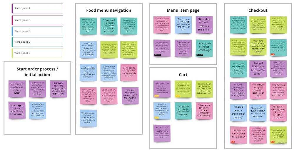
The user research was helpful in highlighting recurring pain points and frustrations users shared when ordering food through an app. It also pinpointed key features that would be helpful to users if they were included.
Red Barn Restaurant and Brewery was identified as a direct competitor as it is also a brewery/pub of similar size with the same target audience. The Curragh Irish Pub was also identified as a direct competitor because it also serves the same type of food, and also targets adults. Applebee’s was chosen as an indirect competitor since it serves the same type of American food and offers alcohol, but it appeals mostly to families.
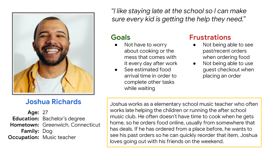
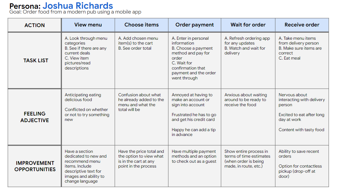
Joshua is a busy working individual who needs an quick and simple way to order food because he doesn’t have time to prepare or cook meals after a long day.
Users were tested on the low-fi prototype to find out if they can quickly and easily complete orders or run into to any challenges when navigating through the app.
Participants were all full-time employees who regularly order food online and are familiar with food ordering apps. Two males and three females, between the ages of 24 and 45.
Unmoderated virtual usability study, participants given introduction and instructions to view the prototype while completing prompts.
"I would want a tipping option, especially for delivery since I want to be able to tip ahead of time and not at the door with the driver."
"I don't know why there would be an edit button, I don't know what that means." (Suggests the word customize)
"How would I favorite an item? I saw an option for favorites in the navigation but I can't find a way to do that on the page. That would be a feature I would like and use."
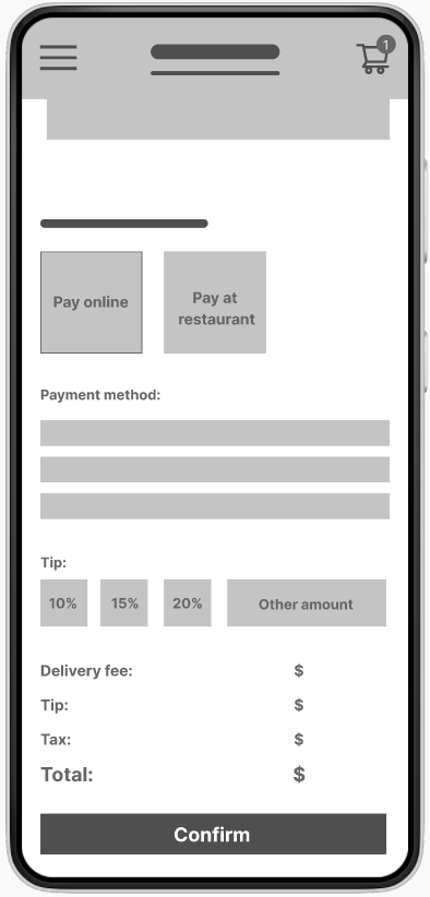
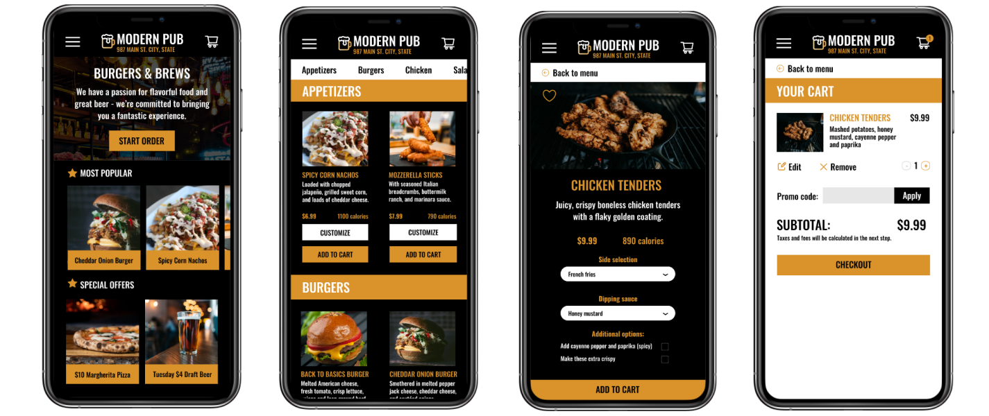
Added a section on delivery fees and the option to tip in the checkout process
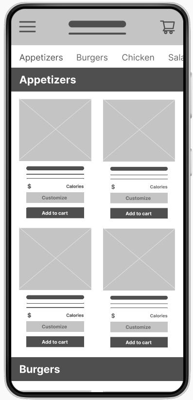
Added a customize button for each menu option next to a direct add to cart button
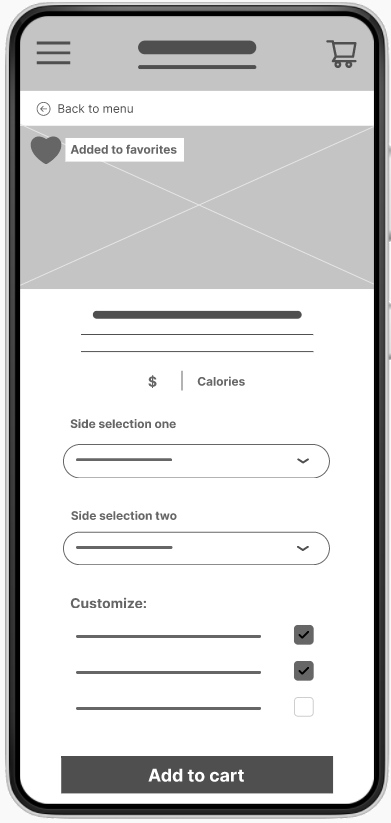
Added the ability to favorite menu items and made it more prominent
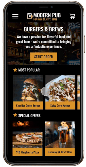
The high-fidelity prototype addresses the original user pain points, makes additions based on the findings from the usability study, and includes features users deemed important for a menu and ordering app.
The app would need to be further fleshed out in terms of additional app features and sections such as the favorites feature as that was something deemed important by users. Additional user testing revolving around the newest iteration of the app would also be beneficial, as the design could be tested now too.
"The checkout options kind of account for everything, I wouldn't change anything."
"It was very easy to navigate through the menu. I think the way it is laid out is the best way I have seen so far."
*This project was completed through the Google UX certificate program.