Design a website that helps users find safe, affordable places to live by providing a clear, stress-free experience.
Surveys were distributed to participants that have gone through the apartment finding process before and are familiar with apartment finder apps and websites as this would be the target audience for this new experience. Survey questions were tailored to pinpoint specific pain points and opportunities for features users would want or consider helpful.
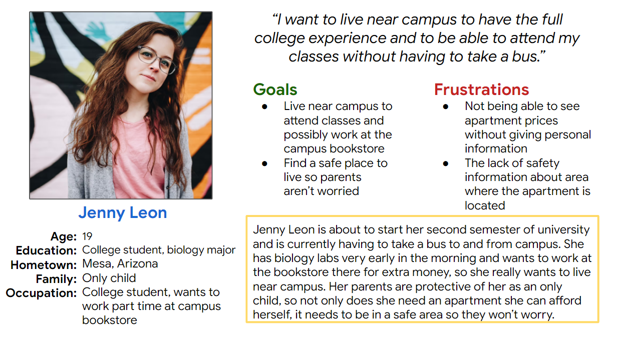
Jenny is a college student who needs to find an affordable, safe apartment because she wants to live alone close to campus.
Participants were all people who have gone through the apartment finding process before. One male and four females, between the ages of 21 and 56.
Unmoderated virtual usability study on the high-fi prototype, participants given introduction and instructions to view the prototype while completing prompts.
Prompts were based on completing certain tasks around the site such as how they would go about beginning their search for an apartment, viewing specific features of an apartment, what they would do once interested, and asking follow-up questions about whether or not they were satisfied with the information presented and what was missing.
"Stumbling across "At a glance" I finally found the area safety rating. I think seeing all the numbers and dollar signs in the big blue boxes I just assumed it was something relevant to money and purchasing."
"I don't see any parking information though. What type of parking is there? Garages?"
"I wouldn't use the send message button, I don't really like sending messages and waiting for a response back. I would maybe call but like I said, I would just go down there or apply online."
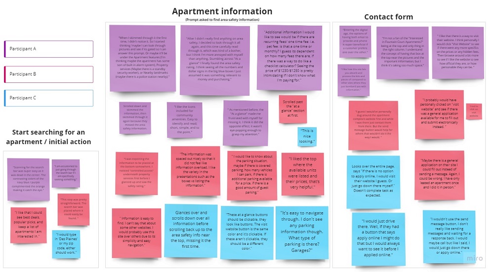
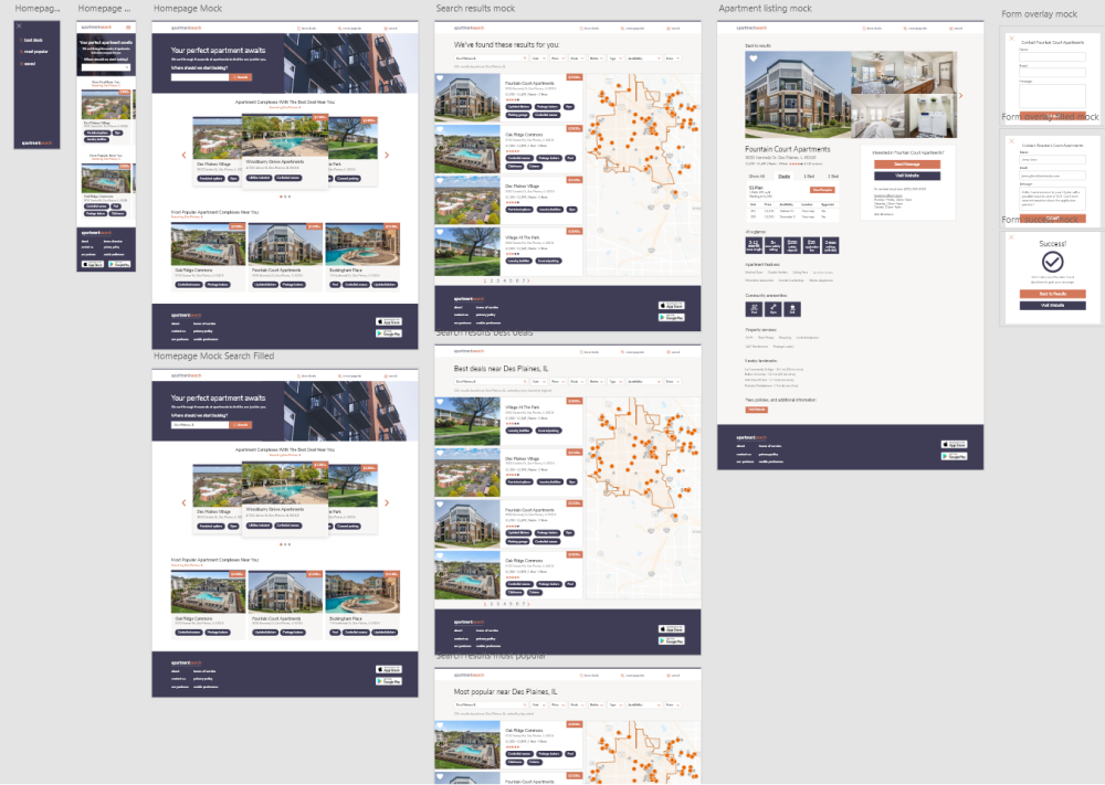
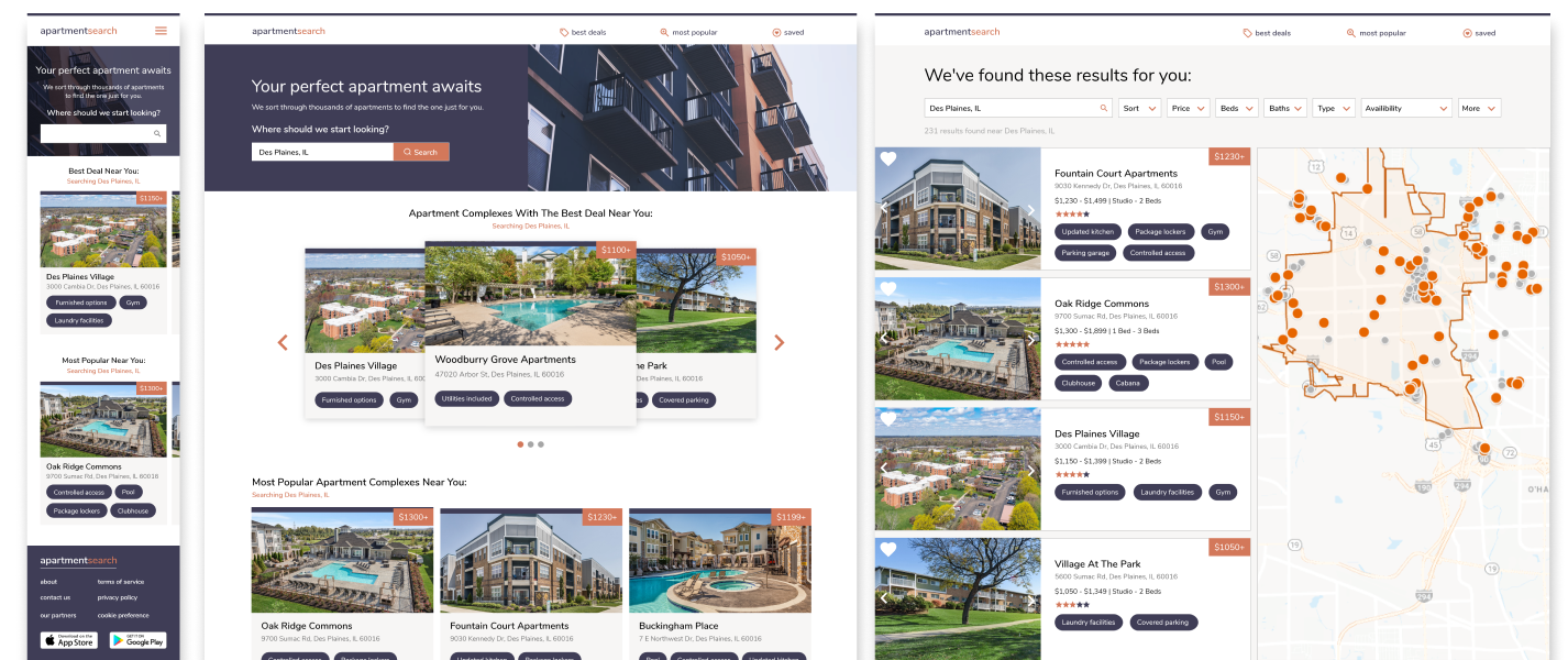
While users find using the website in terms of search and like the way information is presented, they were unable to find the area safety information, a feature that was highlighted to be very important in the user research.
The website would need to add features and information users requested in the usability test, such as parking information and making the area safety rating more prominent.
"It was very easy to navigate around the site, the design made it easy to find information. I like that I could see best deals, popular picks, and keep a list of apartments I am interested in."
"I would like to know about the parking situation, maybe if there is covered parking, how many vehicles I can park, if there is additional parking available for a price, if there is a good amount of guest parking."
*This project was completed through the Google UX certificate program.